
Finecast has spoiled me. It had been so long since I had to work with pewter, I actually had some problems with glueing this model. When the glue didn't bond quickly enough, I whipped out the Insta-Set and spritzed away. For those who don't know what Insta-Set is, it is a catalyzing agent that hardens cyanoacrylate within ten to fifteen seconds. Sounds great right? It also causes heat during this reactions, and could possibly give a person a minor chemical burn (or startle you enough to drop the fig).

The first thing I noticed after priming, was that my Vulkan's face was a bit more blotchy than the GW pic, and upon some careful chipping, I realized I must have over glued the model while building it. Then his arm broke off again - another aspect of Insta-Set is it can occasionally create weaker bonds. Bitch fest ended, I hope.
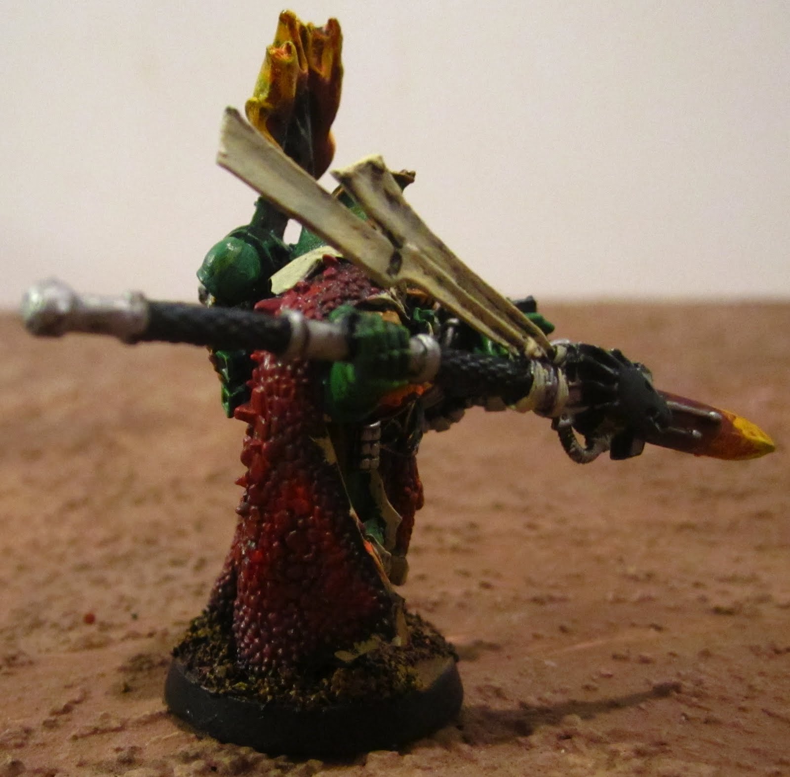
On to the actual painting. Vulkan is probably as blinged out as Calgar, so I started with base coats of P3 Sanguine Base on the cloak and the flame areas, Hammerfeld Khaki on the white areas, Gnarls Green on the greens, and GW Darven Bronze on the gold and Boltgun Metal on the silver. I then gave the whole model a Devlan Mud wash to darken the cloak a bit more and add some depth. The Golds were finished with GW Shining Gold and and Burnished Gold. The Silver with Chainmail and the bone with P3 Menoth White Base. The green is finished with P3 Iosan Green and Wurm Green, and the Black with layers of GW Chaos Black, P3 Coal black and an extreme highlight of GW Codex Grey.

I built up the color on the cloak with P3 Sanguine Highlight and then a highlight of Khador Base, these same layers were used for the purity seals and flames, with a highlight of Sanguine Highlight on the purity seals, and the same color made the orange layer on the flames. I finished the flames with layers of GW Golden yellow and P3 Cygnus Yellow.


The cloak and the flames are particularly striking. Good job mate.
ReplyDeleteThe flames are inside out. Fire is hotter at the core and cools as the flames rise. White or yellow should be the core with oranges and reds added as you get closer to the tips of the flames. No one is sure why GW painted all of the old flames in reverse, but it has gotten a lot of people to do it too. Making the switch will make your flames look alive.
ReplyDeleteThe spear makes a lot more sense because it would be hottest towards the point. Adding a really small bit of white to the very tip will give it that "white hot" look. (It's not like that term came from thin air, right?)
http://photoblog.pratibimb.co/wp-content/uploads/2009/08/fire-and-flame1.jpg
Thanks for the feedback!
DeleteJ I see your point from the link you posted. I'll have to keep it in mind next time. One thing I might say though, is I was pretty much copying GW's color scheme. Lame defense I know, but their stylized flames are part of that GW style, as you noted.